PROGRAM OCTOBER 4, 2017 - NITA LELAND
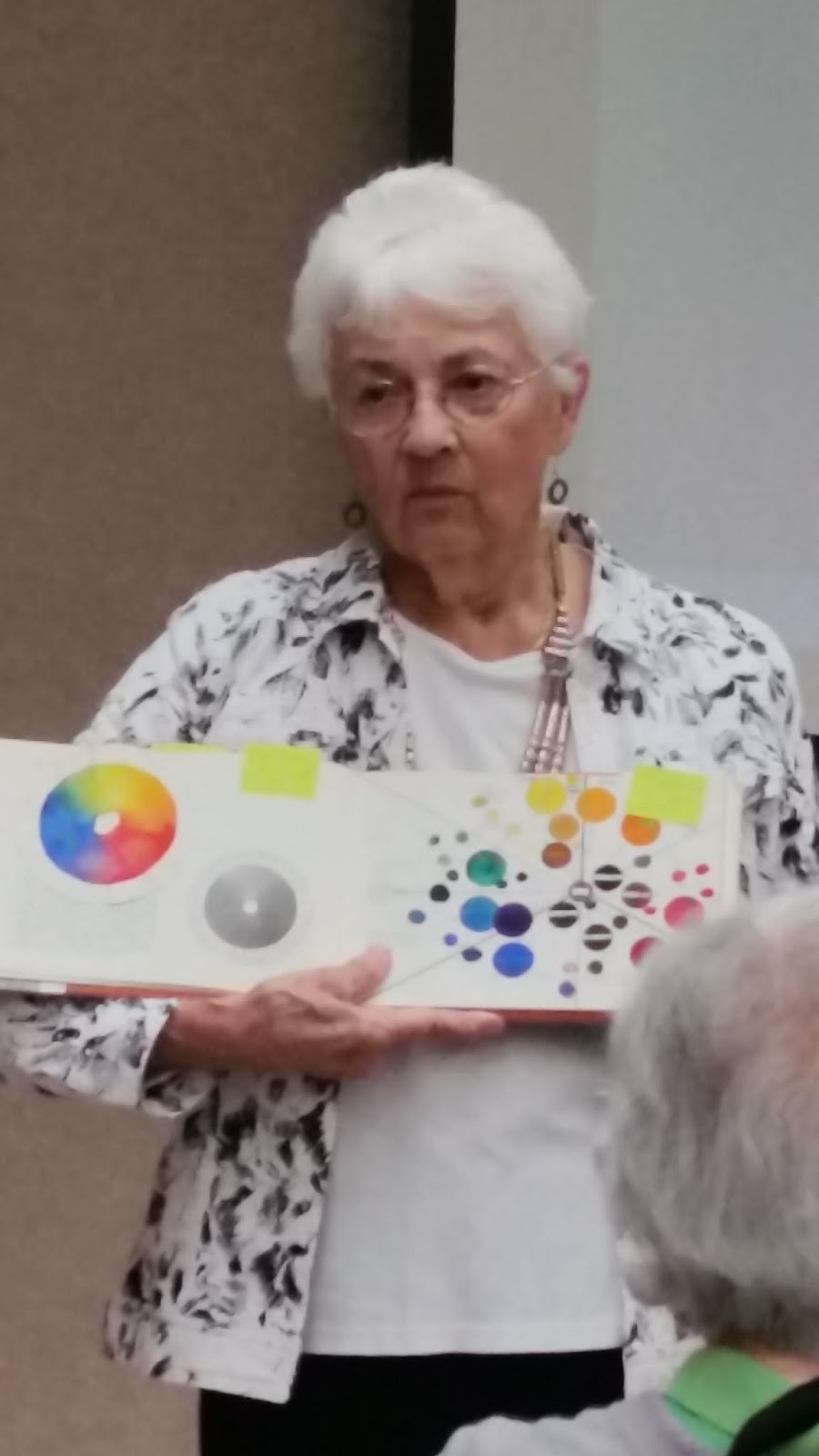
Program Chair, Claudia Taylor announced the October monthly program speaker, Nita Leland, artist, teacher and author. A graduate of Otterbein University, Nita teaches many workshops and has written eight books on the subject of color, creativity and collage.
Nita has worked her entire artistic career promoting the capabilities and possibilities of color. Although she has concentrated her focus in watercolor, she also regularly delves into acrylics. Some of her books are classics in the art world, such as Creative Artists and Exploring Color.
Nita’s presentation is titled “Color Inspiration”. She states emphatically, that the meaning of color is more important than the rules of their use. She credits much of her understanding of the use of color to her study and application of the principles of the color wheel. She expands on the relationships, contrasts and adjacencies of colors within the structure of the color wheel. Nita showed how the use of color can be found in a variety of sources, for example:
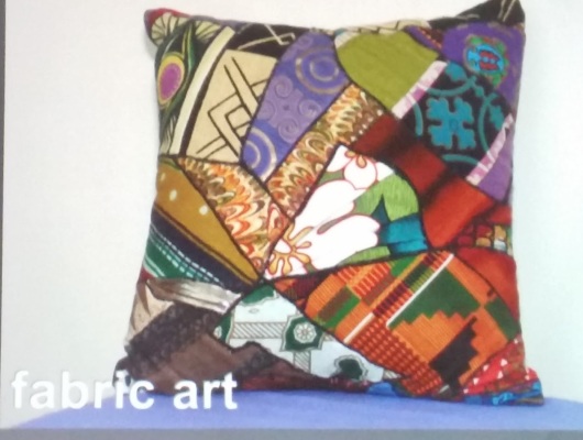
· Fabric Art
· Interior Design
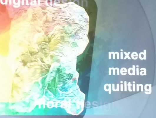
· Digital Design
· Mixed Media Quilting
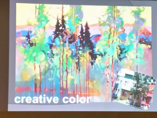
· Creative Color
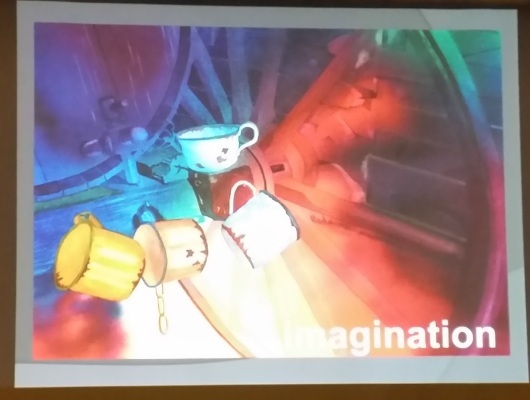
· Imagination
Nita groups her overall views into two categories, Design Elements and Design Principles. Her key Design Elements are:
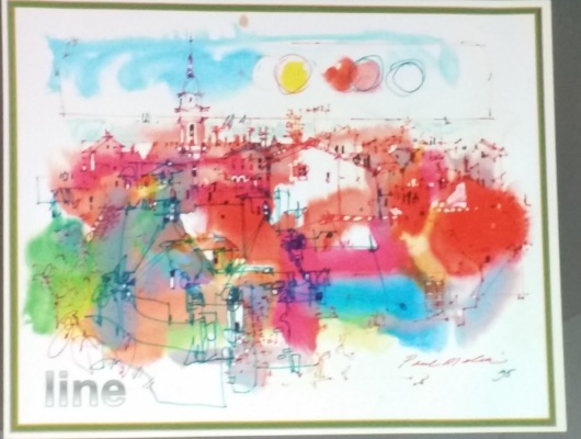
· Line – A tracery element that helps with delineation and separation of color shapes
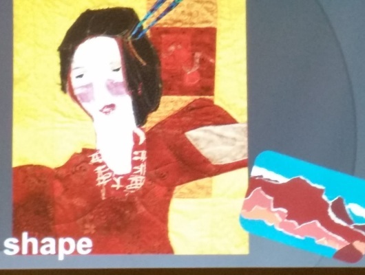
· Shape – Used to create massing elements within a painting
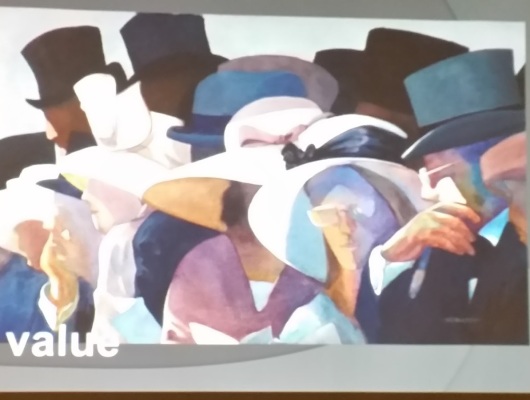
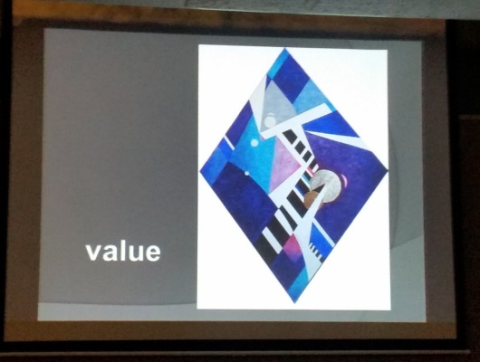
· Value – Key use of lights and darks to accentuate limited use of color
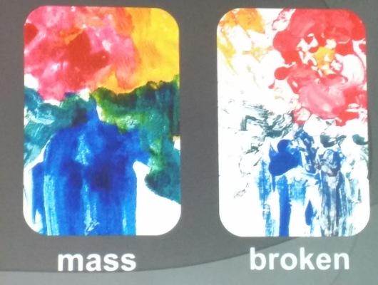
· Color – The many qualities of color can be used in a compositional manner This can be shown in solid mass or broken, loose application
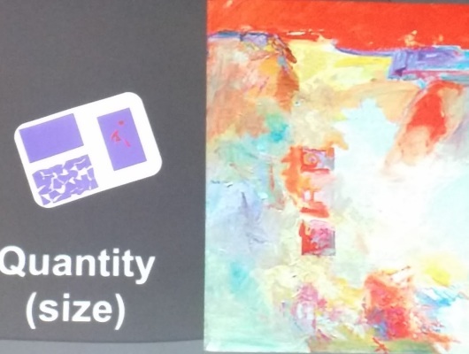
· Size – This can be variation of scale for emphasis
· Pattern – This adds a variety of texture and repetition to a painting
· Movement – The way the eye is drawn through a painting can be done through the placement of elements
Nita’s Design Principles include:
· Harmony – This explores the way elements play off of each other
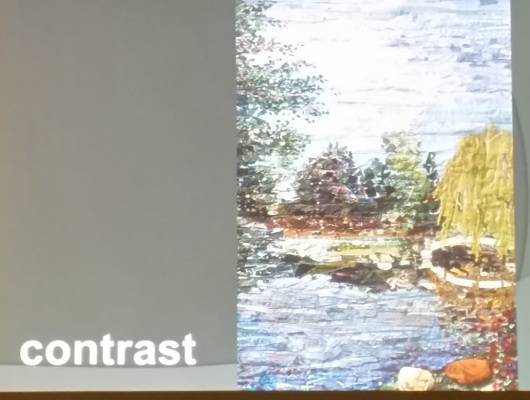
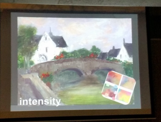
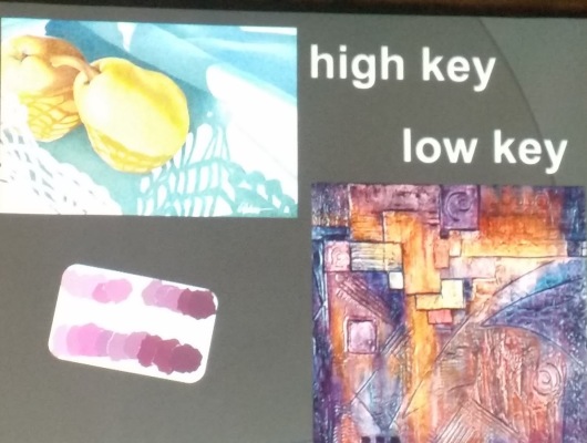
· Contrast – Opposing relationships of color, value and shape – This can be accentuated in by use of high key or low key paintings, which describe the intensity of colors in contrast
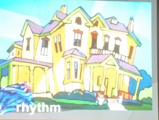
· Rhythm – This is the relationship of shape or color in sequence
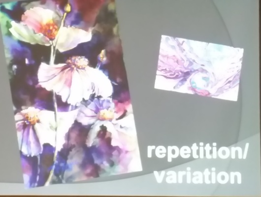
· Repetition/Variation – This explores the change in continuity
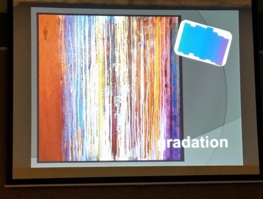
· Gradation – The change over time with color or value
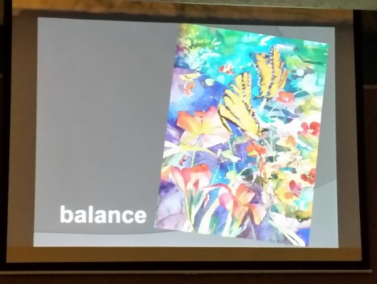
· Balance – The harmonious relationship of shapes, values or colors
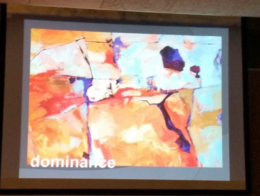
· Dominance – A form of balance, a relationship of large vs. small or similar
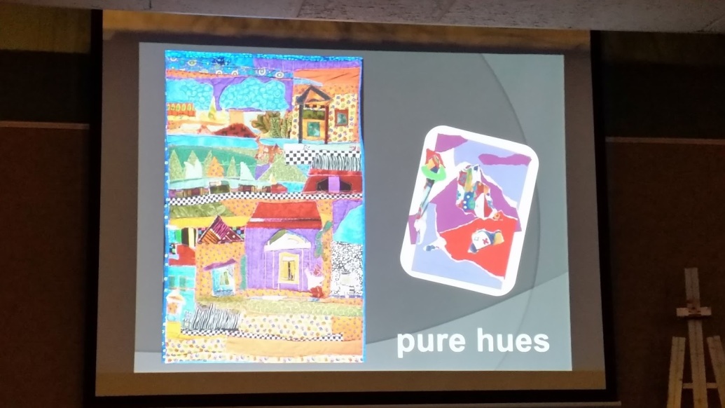
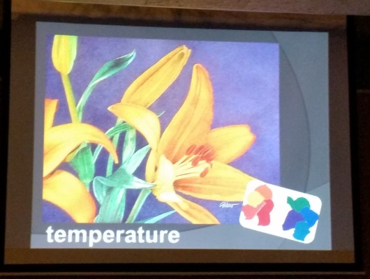
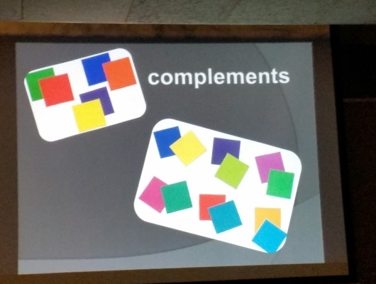
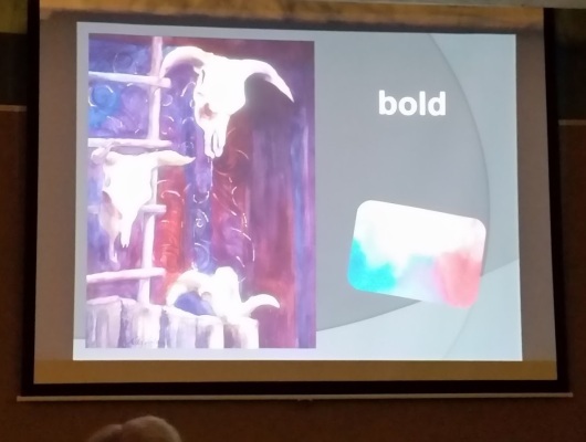
Nita went on to discuss the notion of Color Contrasts. She described the affect of looking at a single color for a length of time, which then changes our ability to measure other color temperatures. Nita also explained that pure hues should be contrasted with other pure hues or neutrals. Examples of how color can be contrasted are:
· Value
· Intensity
· Temperature
· Complements (Primary, Secondary and Tertiary)
· Size
· Harmony
- Triads
- High Key
- Bold
- Modern (Palette)
- Earth Colors
- Bright Earth
Nita described the notion of Expanded Palettes. The use of palettes that emphasize high intensity or full spectrum colors vs. the use of low intensity or limited spectrum palettes can be utilized to varying affects.
She pointed out that Color Schemes can be applied in multiple ways.
Colors can be applied in a narrow range, such as a monochromatic use.
Colors can be used in analogous manner, where colors have a proximity relationship on the color wheel.
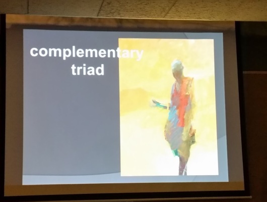
Colors can be complementary, where colors are diametrically opposed on the color wheel. A variation of this can be where colors are split and flank or are adjacent to the complement color.
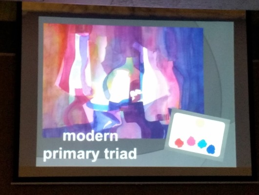
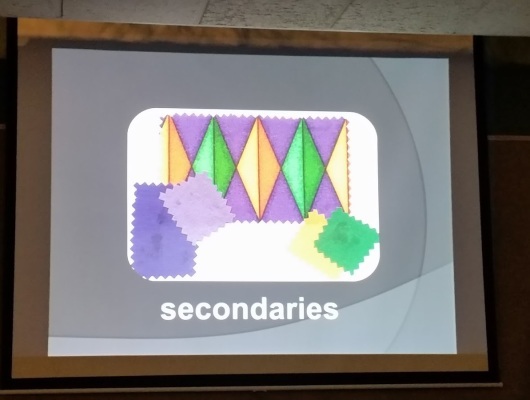
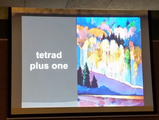
Colors can be arranged as primary colors, to take advantage of their pure hue strengths. There are four (4) color wheel triads:
· Primary
· Secondary
· Complementary
· Modern – This is per color trend colors at a given time
Finally, Nita describes how colors can have an Intuitive relationship that is per the artist intent. Consistency is critical in this approach so the overall painting has a coherent message.
Having Nita Leland present to the Greater Cincinnati Watercolor Society was a great experience. She lives and works here in Cincinnati. She is a major player in the national watercolor scene. The wisdom and insights that she provided to our membership was invaluable to our understanding of the use of color.
See you at the next meeting on November 1st, where we welcome Bruce Neville, who will be presenting his demonstration titled, “Capturing the Essence of Your Subject”. He will utilize the one point perspective in this demo. Looking forward to hearing from him.
Submitted by Tom Schroeder, Secretary, Greater Cincinnati Watercolor Society, October 2017.
