PROGRAM - NOVEMBER 5, 2014
Marilyn introduced our own Deb Ward, past president, current membership co-chair (and held other past positions in GCWS) who led the Program for this month. Deb has become quite the well-known, published, and most accomplished artist. She is also a Teacher.
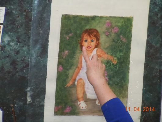
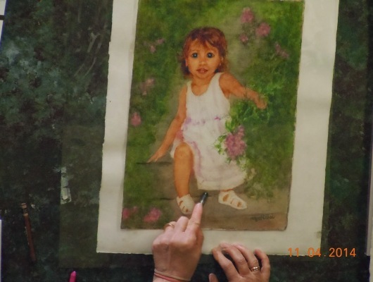
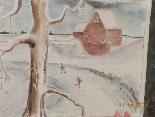
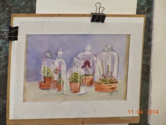
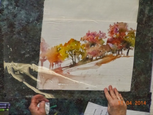
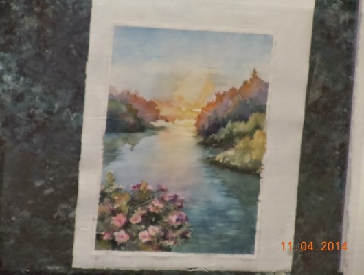
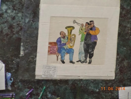
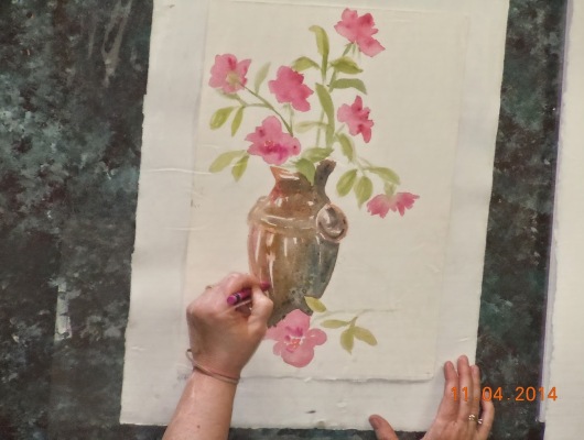
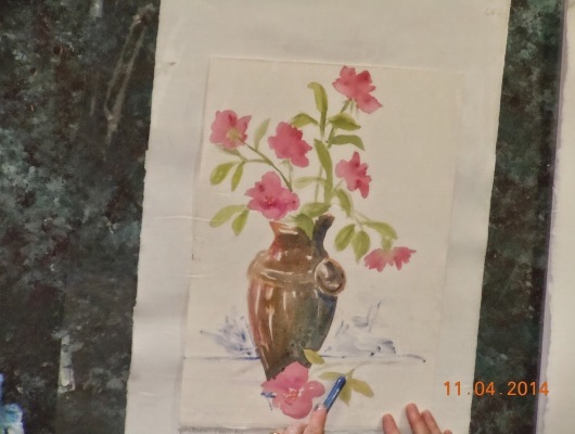
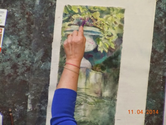
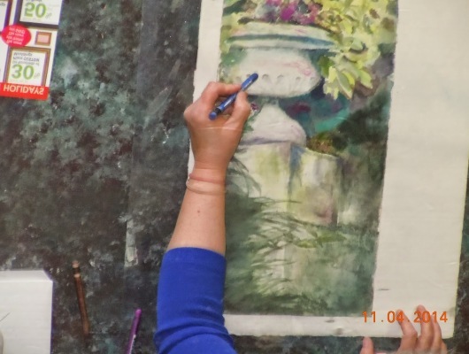
Deb just recently gave a Workshop on Painting Silver and Lace. A number of our GCWS members who attended brought in their finished paintings for Deb to show to the group. They were amazing! Then, we got down to the business that we came for – Critiquing the B+ paintings the members brought in, to see if suggestions could be made that would make them A+ paintings.
Deb distributed some excellent materials about the Elements and Principles of Design, to help everyone learn to critique a painting (particularly, your own). A five-minute time limit for each critique was established, with Eileen Hulsman acting as time-keeper. The time flew by, but all paintings were shown and critiqued. When the artists complete the suggested changes, many will certainly be show-worthy.
Some of the very useful tips, recommendations, and suggestions that were made as the paintings were shown:
- One can use a sheet of acrylic to lay on top of your painting, and then try out some colors or other changes on this, without disturbing what you already have there.
- When painting white items, try not to use gray for the shadows, especially for flowers. Use a blue or violet, etc. to keep them “alive”.
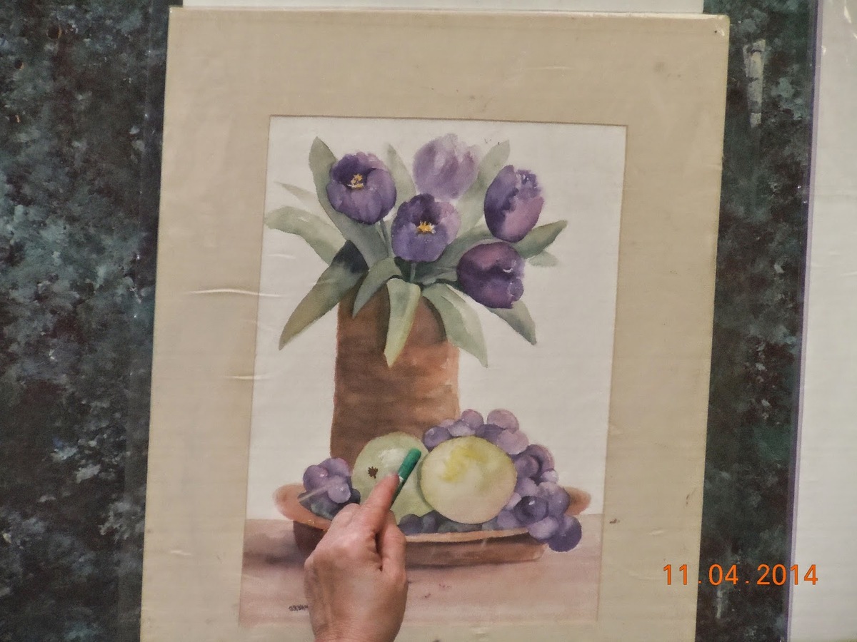
- When planning a small painting, you need to find some way to emphasize the main item or focal point when it is viewed from a distance, so it doesn’t get lost.
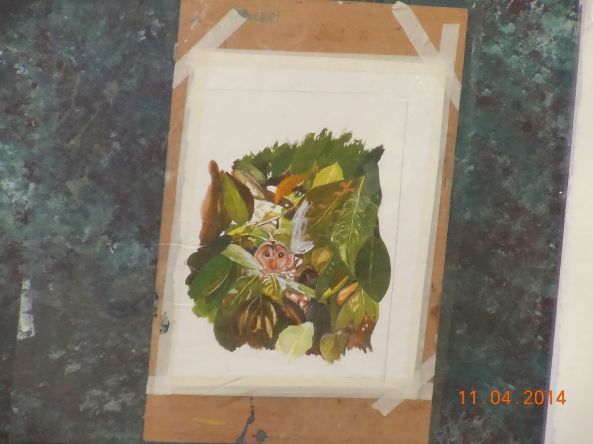
- Find connections or make connections between items in your painting, either by overlapping them, or make some larger to meet with the smaller items, etc.
- When composing your painting, make sure there is a focal point (a “star”); make sure that the “lines” do not lead your eye off the page.
- Decide on the direction of your light source, and make sure all shadows are coordinated.
- Use all of your paper; don’t have too much empty space around your subject.
- You might want to study the Elements of Design and the Principles of Design, and plan your composition accordingly.
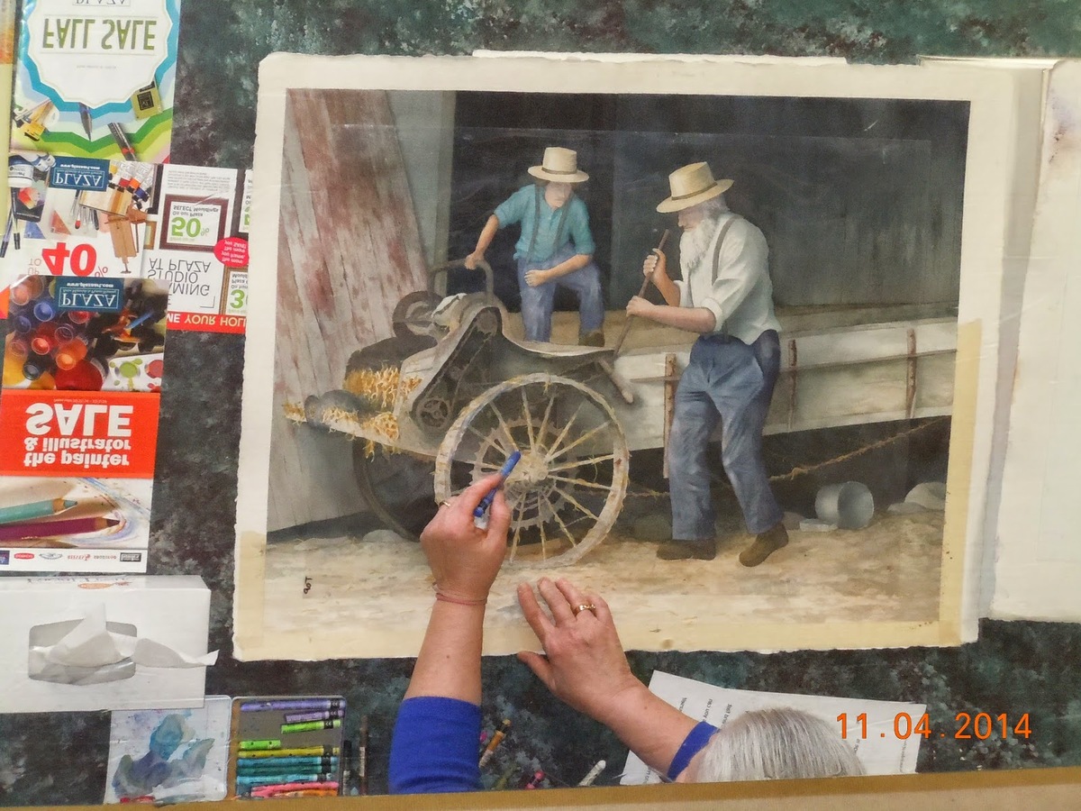
- Or, you might want to just defy these and do your own thing! Go for it!
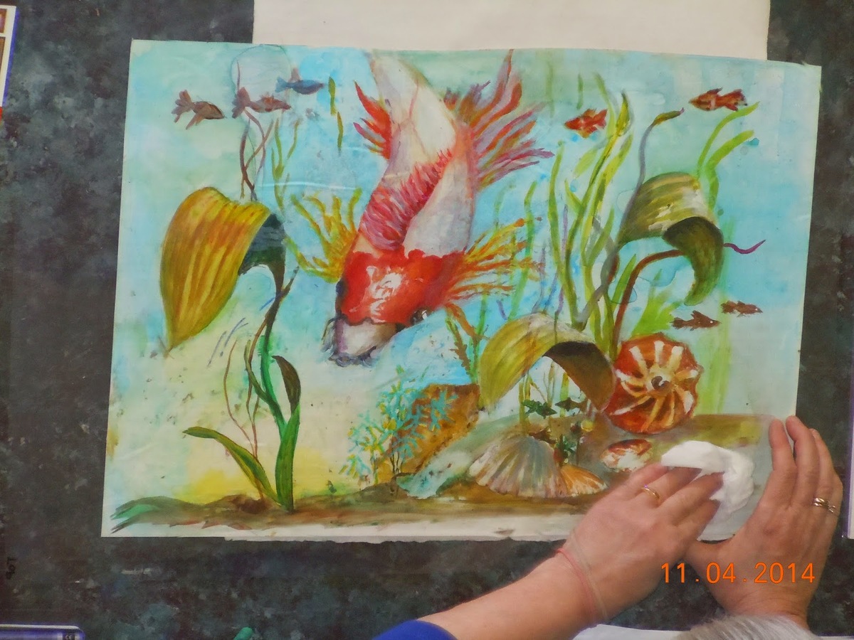
- But, the one word that helps almost every painting that we do is: Value; Value; Value!
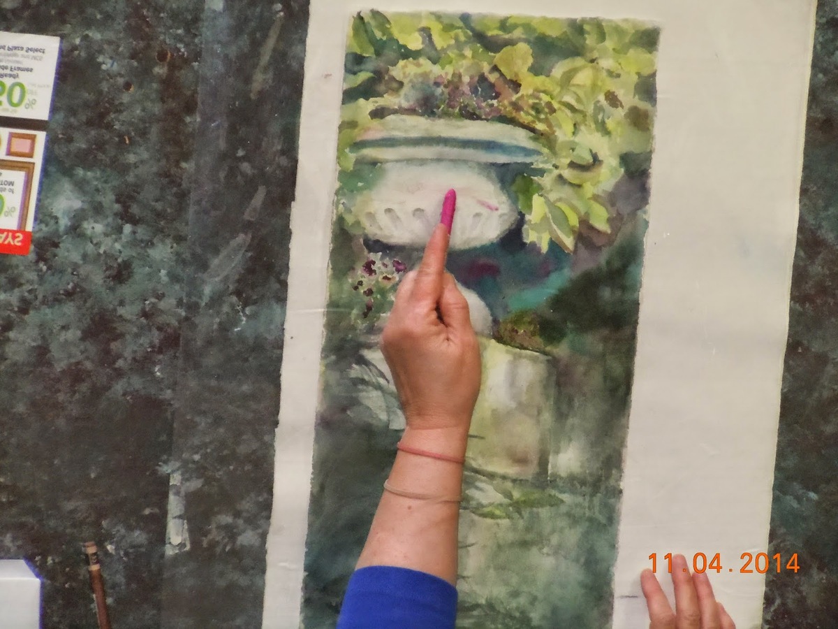
- Almost always, a bit of a change in your values bumps up the rating on your painting. Be Bold!
The group really enjoyed this session of Critiques, and suggested that we do this at least once every Program Year.
The names of everyone who brought in a painting to be critiqued were put into a bowl, and three names were pulled to win a $25 gift card to Plaza Art. The lucky winners were Claudia Taylor, Joyce Grothaus, and Nancy Ulmer. Congratulations!
Submitted by Joyce Grothaus, Secretary GCWS, November 2014
Photos courtesy Jane Hittinger

