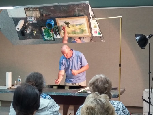
PROGRAM - JULY 11, 2018 - CHRISTOPHER LEEPER

Tom Schroeder introduced our guest artist Christopher Leeper, whose program was titled “It’s Hard Being Green.” This was a summer landscape watercolor demo with a focus on drawing, design, and color mixing (especially green) as they apply to a summer landscape watercolor.
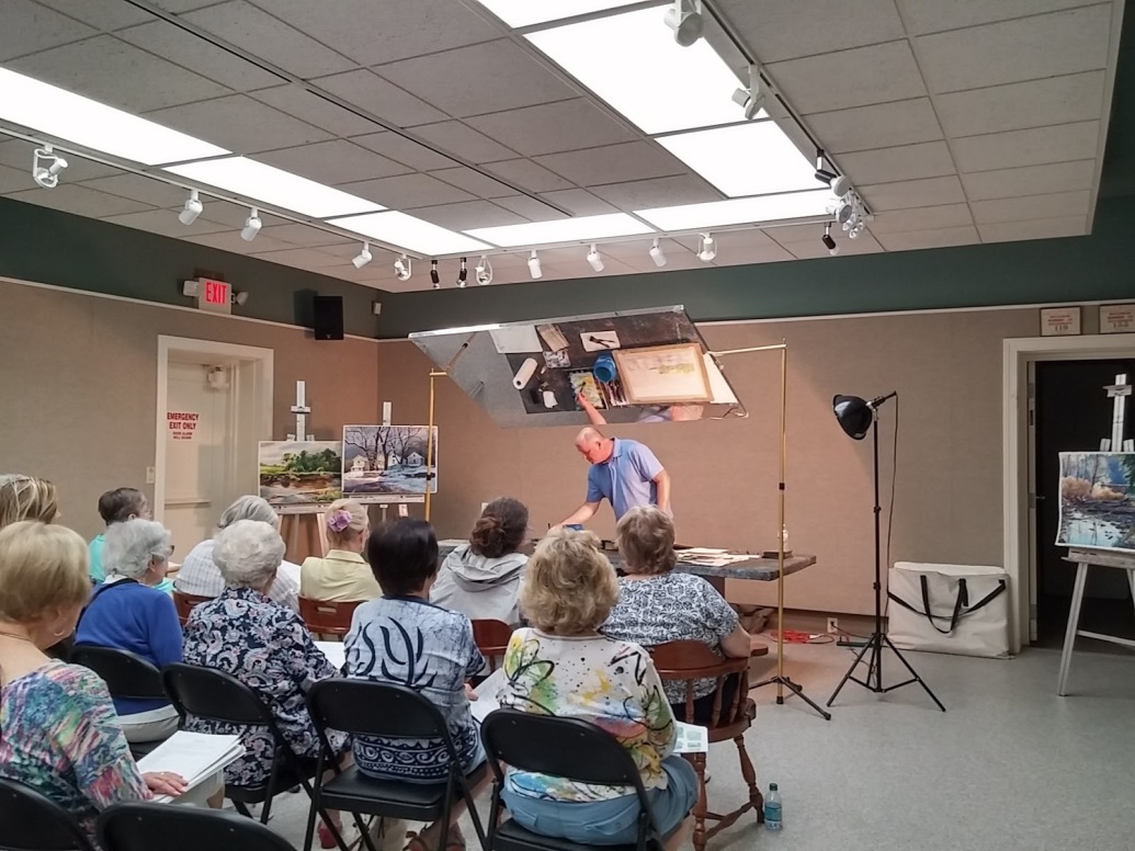
Christopher Leeper is an artist from Canfield, Ohio. He is a realistic artist who paints in all mediums. He began in watercolor but now paints a lot in oils as well as acrylic on occasion. He enjoys painting in pleine aire events and competitions, and he’s a popular painting instructor. He is the author of “Realism in Watermedia”, North Light, and has illustrated four children’s books. His work is featured in many books and publications including Artist Magazine, American Artist, Pleine Aire Magazine and Ohio Magazine. Christopher is a member of the adjunct faculty at Youngstown State University.
Christopher does not stretch his paper, merely tapes it to a board. He likes Arches paper (140 or 300 lb.), Waterford 200 lb.), Strathmore Gemini (300 lb.) and Fabriano (300 lb.) cold pressed. He uses Silver Brush Black Velvet brushes (squirrel/synthetic blends) in an assortment of rounds and flats. He also uses Princeton Neptune large rounds (synthetic squirrel) and a ½ inch Quiller synthetic flat brush, among others.
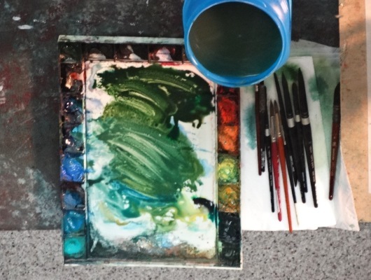
The artist’s demo was based on making greens, but he uses a primary palette of yellow, blue and red to make greens. His palette is actually a split primary palette, using both cool and warm versions of each of the primaries. The following paints from Daniel Smith are colors that he often uses:
Hansa Yellow Light, New Gamboge, Cadmium Orange, Quinacridone Red, Organic Vermillion, Rose of Ultramarine, Pthalo Blue, Ultramarine Blue, Cobalt Blue, Manganese Blue, Indathrone Blue, Cobalt Teal, Pthalo Green, Permanent Brown, Quinacridone Gold, and Quinacridone Burnt Orange.
He does use other brands and colors too, but he tends to stay away from the cadmiums. He also mentioned the three components of color – the intensity, the value and the temperature.
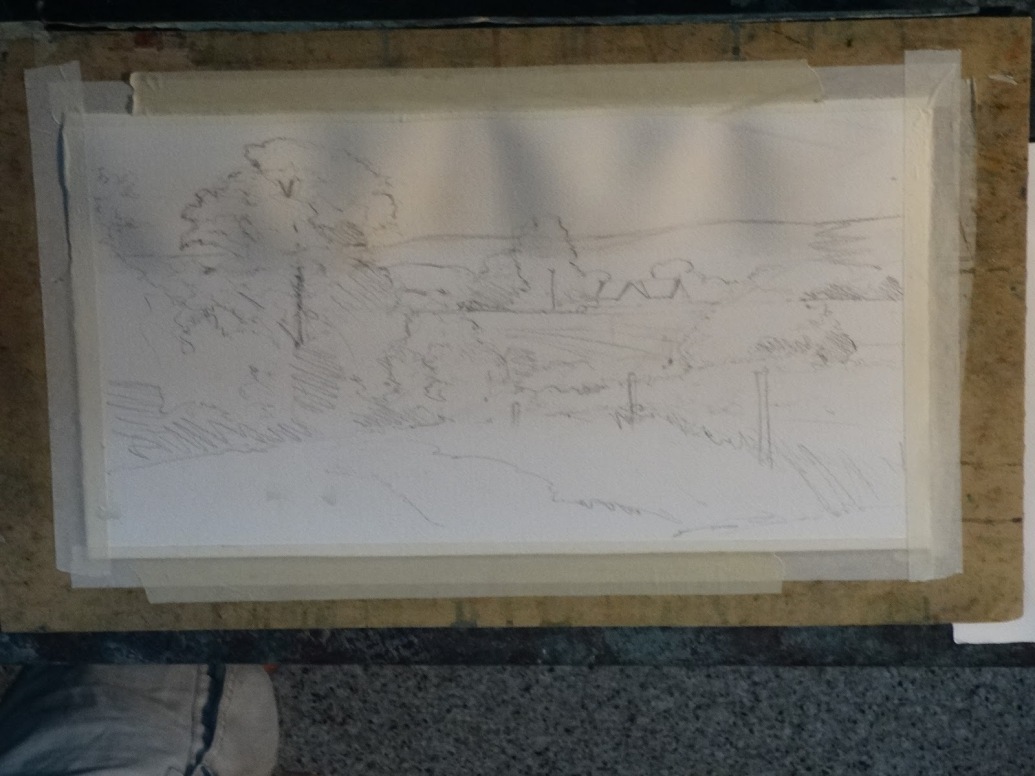
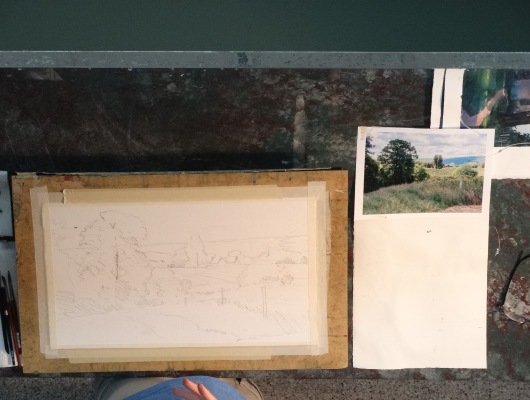
Christopher talked about his drawing before he began painting. He pointed out that even his pencil lines varied in value. Some lines were bolder and other lines were lighter. He referred to the lighter lines as suggestions and the bolder lines as orders, these being the areas of high contrast that he doesn’t want to lose as he begins painting. Also, although his drawing wasn’t highly detailed, he suggested that we make sure that the drawing gives us enough information. For example, if the drawing has a wide open area in the foreground, you should decide what you are going to do with it before you start painting. Put enough information in your drawing to break up the space and don’t assume that you can work it out as you paint.
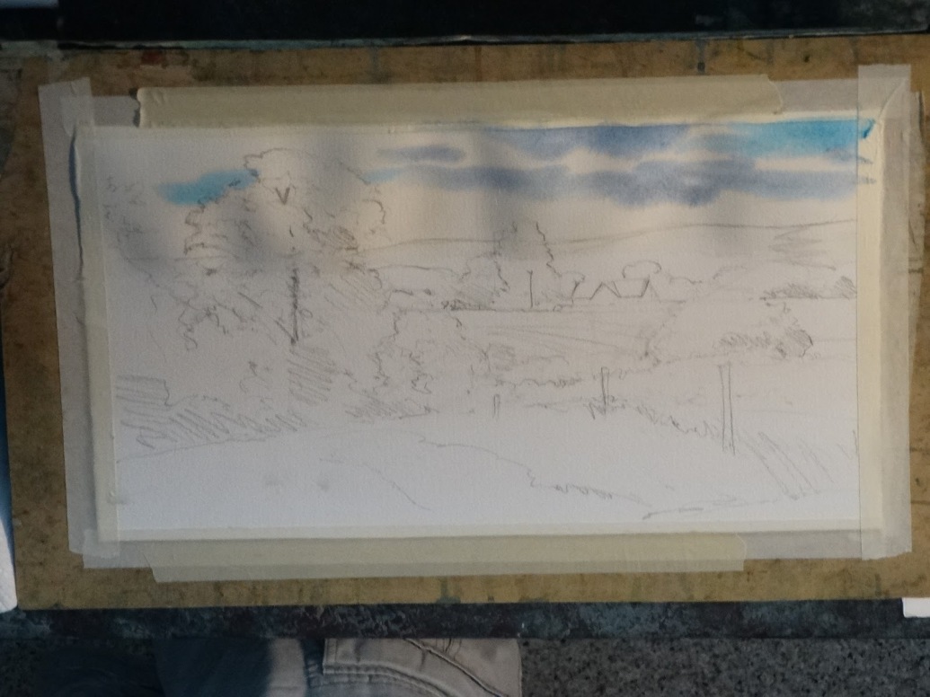
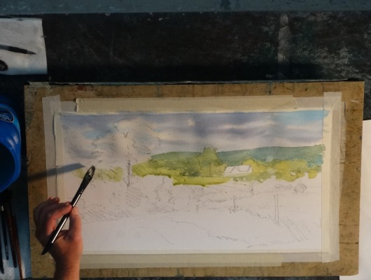
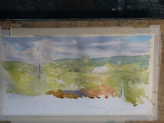
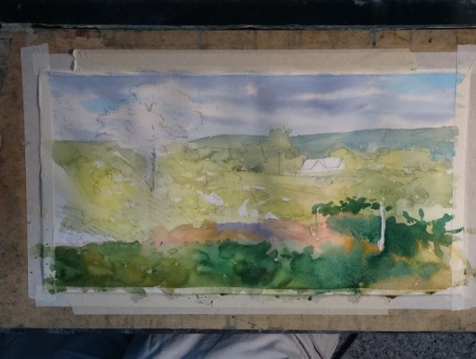
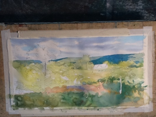
Several tips were given to us for starting to paint. First, think of things as abstract shapes instead of the things they are. Try to connect the objects in the drawing into abstract form. He also said to use color on the white paper – avoid graying it down at the beginning. Use the warmer greens first. Save your whites and go back later in the painting if you need to change them.
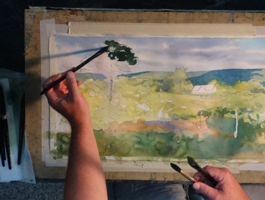
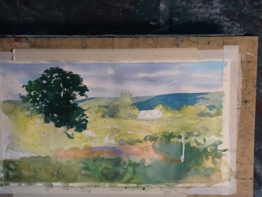
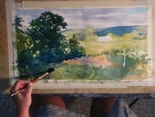
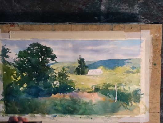
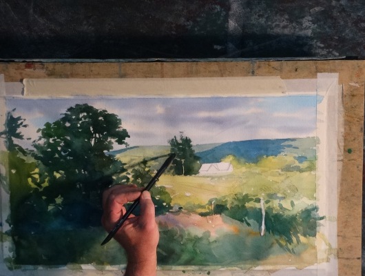
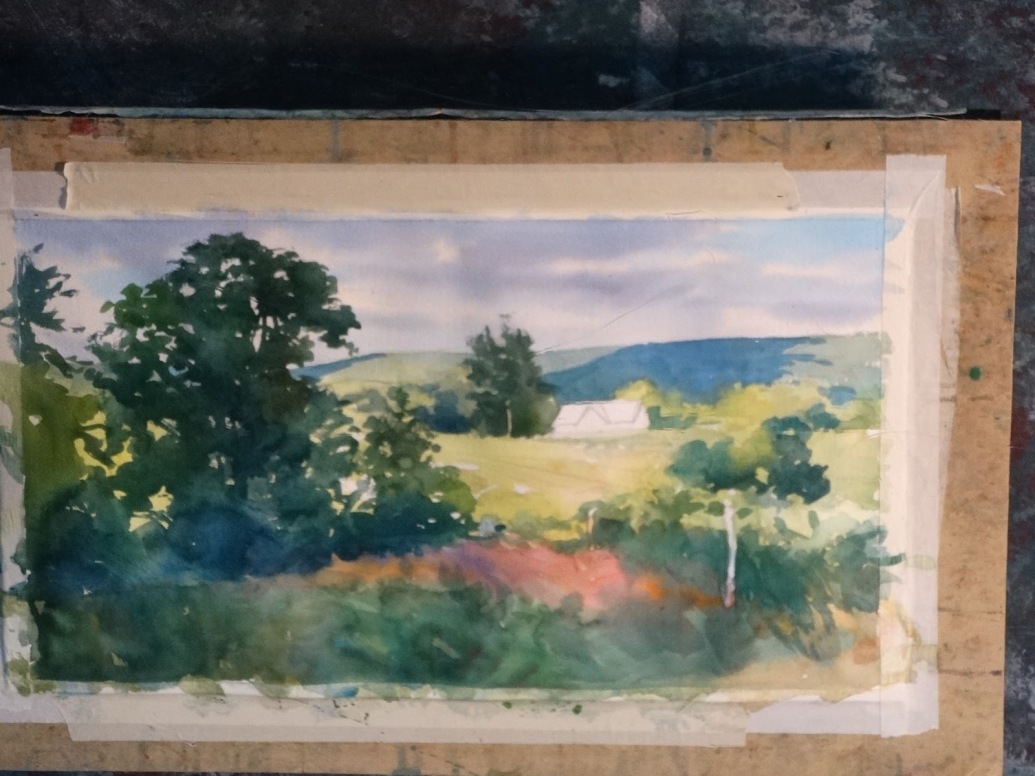
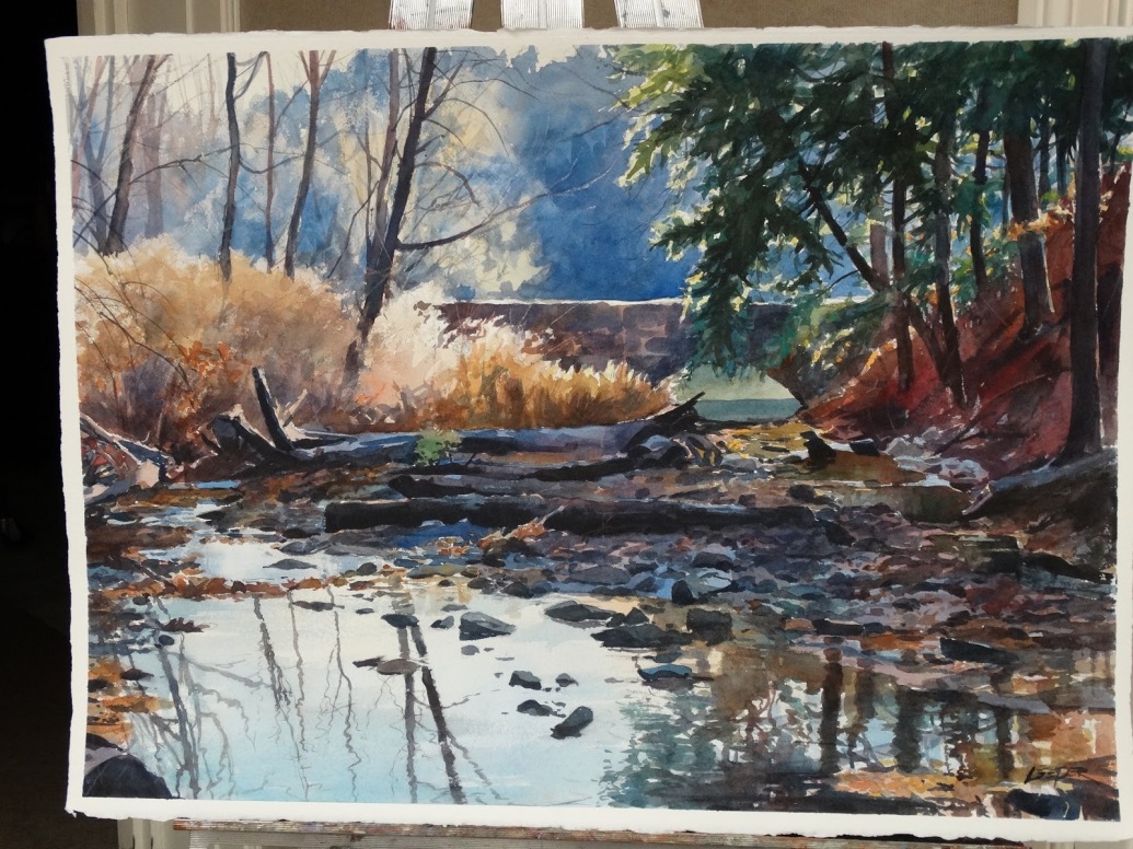
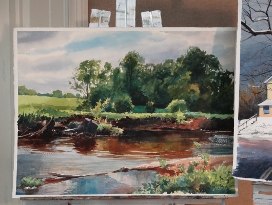
For this painting, Christopher began with the sky. He wet the sky area and used a very diluted wash of cadmium orange in some places. He finished the sky with a variety of blues, leaving some areas of white. He then dried the sky and started applying the greens. He started with warm greens, changing the colors as he went along. He emphasized keeping the washes fluid to avoid hard edges. He talked about loading the brush, then depositing the paint and then moving on and reloading the brush. He continued to work all over the painting in light and middle values. At this point he began to add the dark values. He said not to wait till the end of the painting to put the darks in, but to add some of them sooner so you can start to see the value pattern. Using fresh paint is important especially for mixing darks. Be bold with darks. One last note – pthalo green is wonderful for darks but it should always be mixed and never used alone.
Christopher’s demonstration gave us a lot of useful information, and it was wonderful watching such a talented (and entertaining) artist at work. Thank you, Christopher!